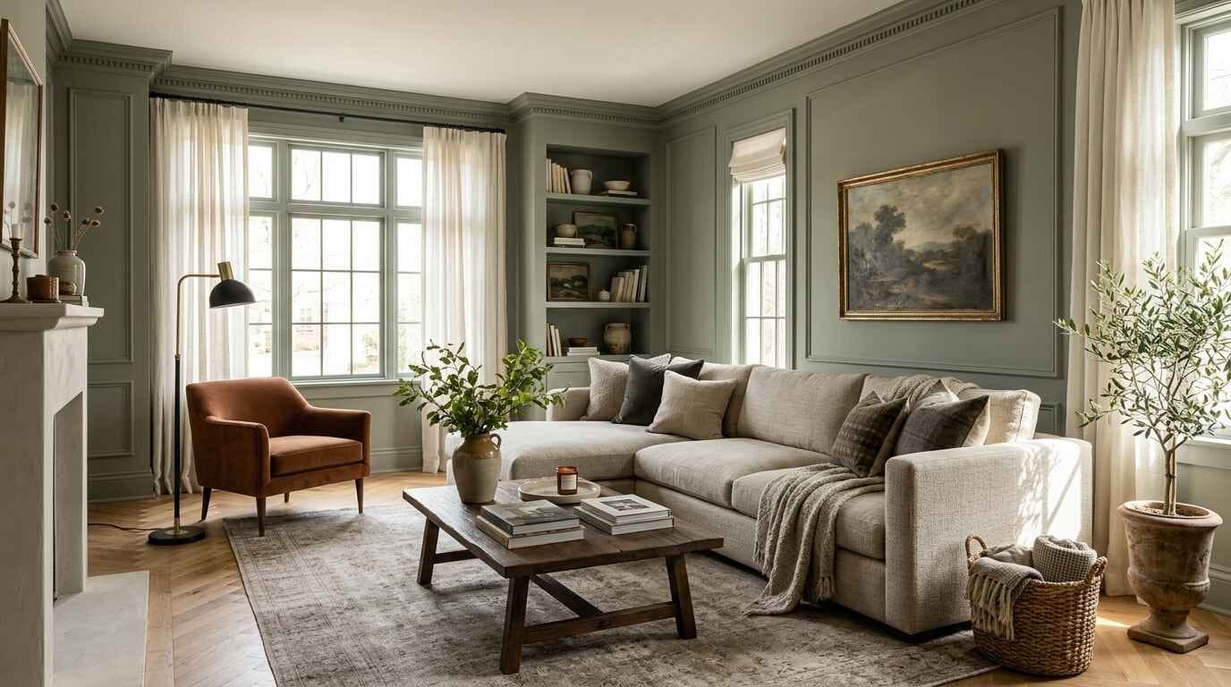
Choosing a paint color for your living room often feels surprisingly difficult. A tiny swatch on a card rarely reveals how a full room will look once four walls are covered. Wall paint helps shape the overall look and feel of your living room. It can influence how spacious the room feels and how well your furniture, fabrics, and wood finishes work together. The ideal hue balances natural window exposure, ceiling height, existing furniture pieces, and personal taste.
These 11 living room paint color ideas offer versatile options ranging from timeless, light-reflecting neutrals to deep, character-rich hues designed to elevate any interior.
11 Living Room Paint Color Ideas
1. Warm White for a Bright and Timeless Living Room

Warm white is a versatile choice because it keeps a living room feeling bright while adding a softer touch than a cooler white. It features faint undertones of cream, beige, or yellow that soften incoming daylight. This makes it an adaptable backdrop across traditional, modern Scandinavian, and minimalist living spaces.
Warm white pairs naturally with textured cream linen upholstery, natural oak coffee tables, and light sheer drapery. It excels in living rooms that receive low natural light or feel visually constrained, bouncing available illumination into darker corners.
To prevent a warm white room from feeling flat or sterile, layer varied textures throughout the space. Incorporate nubby wool rugs, woven baskets, ribbed ceramic vessels, and brass picture frames to introduce visual dimension without cluttering the walls with competing pigments.
- Best undertones: Subtle yellow, linen, or soft biscuit.
- Complementary finishes: Pale oak, bleached ash, brushed brass, and natural linen.
2. Soft Beige for a Cozy Neutral Space

Soft beige brings an immediate sense of warmth and grounded comfort to family living rooms. Unlike cooler stone neutrals that can read chilly under overcast skies, a gentle sandy beige envelopes a room with welcoming undertones.
This shade creates a cohesive, organic aesthetic when combined with unbleached linen slipcovers, reclaimed timber coffee tables, and layered jute or wool area rugs. Soft beige provides enough contrast to frame crisp white window casings while avoiding the sharp transitions of darker accent colors.
To achieve depth rather than a flat monochrome scheme, build a tonal palette. Mix soft beige walls with deep taupe accent cushions, ivory floor lamps, and woven rattan poufs. The varied surface textures keep the neutral palette layered, tactile, and visually engaging throughout the day.
- Best undertones: Sand, wheat, or soft warm taupe.
- Complementary finishes: Medium-toned timber, textured jute, stoneware, and matte black iron.
3. Sage Green for a Calm, Nature-Inspired Look

Sage green serves as a gentle, nature-infused alternative to classic neutrals. Blending muted green with gray undertones, sage introduces organic tranquility without demanding bold, high-contrast styling.
This earthy botanical shade pairs harmoniously with light-toned wooden shelving, ivory upholstery, and healthy indoor houseplants like rubber trees and cascading pothos. It transitions effortlessly between modern apartments, relaxed cottages, and updated farmhouse interiors.
When selecting a sage green paint, pay close attention to your room’s natural exposure. In north-facing rooms, cooler daylight can make some sage greens appear grayer. Test shades with slightly warmer undertones to see which looks best in your space.
- Best undertones: Silvery gray or muted moss.
- Complementary finishes: Light pine, birch, cream bouclé, and unlacquered brass.
4. Light Greige for Modern, Flexible Styling

Greige unites the clean sophistication of modern gray with the comforting warmth of beige. This balanced hybrid solves one of the most common decorating dilemmas: bridging older warm furnishings with newer cool architectural elements.
Light greige provides an ideal canvas for mid-century modern credenzas, clean-lined cream sofas, and graphic artwork. It highlights crisp white crown molding without the harsh starkness of high-contrast paint pairings. Lighter greige shades can help reflect daylight, while a matte finish may make minor wall imperfections less noticeable.
Because greige contains mixed pigments, its appearance shifts subtly as daylight moves across the room. Greige can look warmer in some lighting and cooler in others, so check your paint sample in both daylight and evening light. Always observe this paint across different hours before finalizing your purchase.
- Undertone balance: Features an equal mix of cool gray and warm beige to match varied hardware.
- Trim pairing: Looks exceptionally crisp beside pure white baseboards and window moldings.
5. Dusty Blue for a Soft and Sophisticated Room

Dusty blue delivers tailored color while retaining the calming serenity of a neutral. By incorporating slate or gray into its base, this hue avoids the juvenile tone of pastel baby blue and the intense saturation of primary shades.
Dusty blue looks refined in rooms with architectural wall molding, where light and shadow can play across painted panels. It complements light oak shelving, ivory bouclé seating, and brushed gold floor lamps. It adapts well across coastal retreats, urban apartments, and tailored classic homes.
To ensure your living room remains inviting, counterbalance dusty blue’s inherent coolness with tactile warm elements. Layer in camel-colored throw blankets, caramel leather trays, and warm amber glassware to ground the palette.
- Best undertones: Slate, charcoal, or smoky mist.
- Complementary finishes: Warm oak, antique brass, linen white, and cognac accents.
6. Terracotta for Warmth and Earthy Character

Terracotta brings rich, grounded character to living spaces craving depth. Drawing inspiration from sun-baked clay, rust, and desert landscapes, this hue delivers bold warmth without the harsh intensity of primary red or bright orange.
Terracotta creates an enveloping, cozy atmosphere when paired with dark-stained exposed ceiling beams, deep espresso bookcases, and neutral oatmeal sofas. It provides an ideal backdrop for leafy fiddle-leaf figs and textured woven fiber baskets.
If applying terracotta across all four walls feels too intense for a small floor plan, consider painting a single architectural focal point, such as a fireplace chimney breast or an alcove behind custom shelving. Balance the wall color with light cream drapery to maintain an open, welcoming baseline.
- Best undertones: Spiced rust, baked clay, or warm cinnamon.
- Complementary finishes: Dark walnut, distressed leather, raw clay ceramics, and ivory linen.
7. Blush Pink for a Soft and Elegant Interior

Muted blush pink acts as a sophisticated warm neutral that introduces soft elegance. Far from sweet candy pink, mature blush shades contain beige, peach, or gray undertones that yield a delicate, powdered plaster effect on drywall.
This color pairs gracefully with off-white sofas, light ash coffee tables, and traditional plaster fireplace mantels. Depending on its undertones and the room’s lighting, blush pink can give the living room a soft, warm appearance.
To maintain an adult, design-forward aesthetic, avoid pairing blush with vibrant pastels. Ground the soft pink walls with structured elements: architectural picture-frame molding, framed vintage line art, and brushed brass light fixtures.
- Best undertones: Dusty rose, soft peach, or chalky beige.
- Complementary finishes: Warm travertine, unlacquered brass, ivory velvet, and light oak.
If you love decorating with pink, explore these pink living room ideas for more inspiration on creating a soft, elegant space.

Navy blue offers depth, drama, and tailored luxury. Navy blue can create a rich, cozy atmosphere, particularly when paired with warm lighting and lighter furnishings.
Deep navy looks striking on paneled accent walls or across integrated built-in library bookcases. It provides strong contrast against crisp ivory sofas, patterned oriental rugs, and warm walnut millwork.
Dark colors require intentional lighting schemes. If using navy blue in a living room with modest daylight, install multiple warm light sources at varied heights: shaded brass wall sconces, directional reading lamps, and dimmable table lamps to illuminate the pigment evenly.
- Best undertones: Midnight indigo or charcoal navy.
- Complementary finishes: Rich walnut, polished brass, cream wool, and antique gold.
9. Soft Butter Yellow for a Cheerful Feel

Soft butter yellow infuses living rooms with gentle cheer and sunny optimism. Unlike saturated mustard or primary bright yellow, pale buttermilk carries cream undertones that bathe the room in warm light without visual fatigue.
This shade works well with white trim, pale oak flooring, and beige upholstery. It can suit traditional, cottage-inspired, and contemporary interiors, depending on the furnishings and the shade of yellow.
To avoid a yellow that looks overly sharp or neon under artificial illumination, select a shade that appears almost off-white on the paint chip. Incandescent and warm LED bulbs naturally heighten yellow pigments once the sun goes down.
- Best undertones: Sweet cream, buttermilk, or pale custard.
- Complementary finishes: White painted trim, light oak, sage green pillows, and natural cotton.
10. Olive Green for a Rich, Earthy Atmosphere

Olive green provides a deeper, moodier perspective on nature-inspired decorating than lighter pastels. Featuring rich yellow and brown undertones, olive grounds a living room, evoking the peaceful stillness of dense woodlands.
This commanding shade pairs exceptionally well with warm caramel leather sectionals, dark walnut coffee tables, and rustic stone fireplaces. It can give the living room a cozy, traditional feel, especially when paired with bookshelves, warm wood, and comfortable seating.
To balance deep olive walls, introduce lighter textiles such as cream curtains, pale rugs, and neutral cushions. Layer heavy cream wool area rugs over dark flooring, hang full-length ivory drapery, and incorporate burnished brass light fixtures to provide warm, bright reflective surfaces across the room.
- Seating pairings: Saddle tan or cognac top-grain leather provides rich contrast against the wall.
- Flooring balance: Thick looped ivory wool rugs reflect light upward and soften dark floorboards.
- Metallic accents: Antiqued and burnished brass fixtures glow with warm luster against the green.
11. Charcoal Gray for a Modern, High-Contrast Finish

Charcoal gray delivers a modern, high-contrast backdrop that allows architectural silhouettes and furnishings to stand out sharply. Charcoal gray can add depth and create contrast, helping artwork, light-colored furniture, and architectural details stand out.
Charcoal walls create an exceptional stage for light oatmeal sectional sofas, contemporary walnut wood tables, and oversized abstract canvas paintings. It looks sophisticated on a single feature wall behind a media setup or across all four walls in an urban loft setting.
When working with charcoal, incorporate plenty of warm organic elements to keep the room feeling comfortable rather than clinical. Integrate potted indoor trees, textured boucle throws, and natural timber shelving to soften the sharp monochrome contrast.
- Best undertones: Slate, graphite, or blackened umber.
- Complementary finishes: Pale stone, blonde oak, blackened bronze, and textured cream bouclé.
How to Choose the Right Living Room Paint Color
Consider Your Room’s Natural Light
The direction your windows face fundamentally alters how paint pigments behave.
- North-facing rooms receive cool, bluish light that can make cool grays and crisp whites appear dull or chilly. Choose shades with warm undertones, such as soft beige, terracotta, or warm butter yellow.
- South-facing rooms enjoy warm, intense sunshine throughout the day. These spaces can handle almost any color, including cooler sage greens, dusty blues, and saturated navy.
- East- and west-facing rooms shift dramatically, experiencing either warm morning glow or golden afternoon illumination. Observe paint cards across both morning and late afternoon hours before committing.
Think About Room Size and Ceiling Height
While paint cannot physically alter walls, color contrast alters how boundaries are perceived. Pale colors with high light-reflectance bounce illumination, helping a compact living room feel open and airy.
Darker colors such as charcoal and navy can create a more intimate atmosphere. Their effect depends on the room’s lighting, proportions, and contrast with the ceiling, trim, and furnishings. If your ceilings are low, keep ceiling paint a shade lighter than the walls to draw the eye upward.
If you’re also working with limited space, these small living room layout ideas can help you make better use of your available floor space.
Match the Color to Your Furniture
Paint should complement fixed, expensive elements that are costly to replace. Examine the underlying tones of your flooring, hardwood finishes, main sofa fabric, and stone accents.
Warm wood tones like oak, walnut, and cherry harmonize with earthy sage, cream, and terracotta. Contemporary gray-washed floors pair more cleanly with balanced greige, charcoal, or dusty blue.
Decide Between a Neutral and a Bold Color
Consider how often you enjoy updating decorative pillows, curtains, and artwork. A versatile neutral like warm white, beige, or light greige allows you to transform your accent palette every season without repainting.
A distinctive wall color like olive, navy, or terracotta makes a bold architectural statement, turning the walls themselves into the room’s main decorative feature.
Test Paint Samples Before Committing
Never select a paint color based solely on an online photo or a paper swatch under fluorescent store tubes. Use paint sample boards or test patches according to the manufacturer’s instructions. View them on different walls and at different times of day before choosing your final color.
Examine the swatches in direct morning daylight, overcast afternoon light, and under your evening lamps. Consider the finish, too. Matte finishes generally hide minor surface imperfections better than glossier finishes, while eggshell and satin offer different levels of sheen and cleanability. Check the paint manufacturer’s recommendations before choosing.
Frequently Asked Questions
What is the best paint color for a living room?
The best color balances your room’s natural daylight, room dimensions, and existing furniture. Versatile warm neutrals like warm white, soft beige, and light greige suit almost any layout, while sage green and navy blue add tailored personality without overwhelming the space.
Which paint colors make a living room look bigger?
Light colors and low-contrast combinations can help a living room feel more open, although the result also depends on natural light, furniture placement, and the room’s layout. Warm white, light greige, and soft butter yellow bounce daylight across walls. Painting baseboards and trim the same color as the walls also prevents visual breaks, expanding sightlines.
What are the most timeless living room paint colors?
Warm white, sandy beige, and balanced greige remain the most enduring living room choices because they complement evolving furniture styles. Earthy, muted tones like sage green and warm terracotta also hold lasting appeal across decades.
Should living room walls be light or dark?
Your lifestyle and room exposure should guide the choice. Light walls maximize sunlight and provide a flexible foundation for changing decor. Dark walls create an intimate, sophisticated atmosphere ideal for evening lounging, media viewing, and rooms with high ceilings.
How do I choose a paint color that matches my furniture?
Identify the undertones in your flooring, cabinetry, and largest upholstered furniture pieces. Match warm wood finishes with warm-toned paints like beige, terracotta, or olive. Test physical paint swatches beside your couch fabric to ensure undertones coordinate harmoniously under home lighting.
Conclusion
Choosing the right paint color shapes how you experience your home every single day. The right shade can help create a living room that suits your style, whether you prefer the brightness of warm white, the natural look of sage green, or the depth of navy and charcoal.
Before purchasing gallons of paint, take time to evaluate your room’s natural light, review your existing furniture, and test physical samples across multiple walls. Exploring a few deliberate living room paint color ideas ensures you discover a shade that brings warmth, balance, and enduring beauty to your living room for years to come.

“Urooj Fatima is the founder and lead stylist of Blush Heaven, a digital sanctuary dedicated to budget-friendly home decor and small apartment styling. Trusted by a Pinterest audience of millions each month, she specializes in creating high-end aesthetics for small spaces. Urooj is the creator of the Small Apartment Glow-Up Guide, helping women worldwide transform their rooms into cozy, blush-toned havens.”